
Trevecca Brand Manual

Introduction
Consistency is important.
Consistent training yields stronger athletes, while consistent practice creates better musicians. Consistency is important in scientific research and for writers honing their craft. Even in our faith, consistency in the worship and disciplines help us to grow.
Consistency is also important as a university. Trevecca Nazarene University is a Christian community providing education for leadership and service. The way we present that message to the world shapes our reputation—so we must be consistent in the way we represent the University and communicate our mission.
That includes our visual identity. Our visual identity, as represented in this manual, is designed to demonstrate Trevecca’s mission to the world. The design elements—including our logo, color palette and key messages—work together to embody that message and convey it to a larger audience.
It also includes the way we talk about and speak for the University, whether on the Internet, via social media or in other venues. In this manual, you’ll find guidelines that will help our message remain clear and consistent. All of the standards and guidelines presented in this manual are intended to provide a framework for consistent communications that effectively represent Trevecca Nazarene University.
 |
DR. DAN BOONE |
The Logo
The logo symbol is a powerful image evoking the culture of design and serves as the connection between the strength of communication and the different points that influence.
The Trevecca Nazarene University logomark is comprised of two elements, the logo symbol (the shield) and wordmark (the rendering of the University’s name in its distinctive typeface). The logo symbol can be used on its own, but the wordmark must NEVER appear without the logo symbol.
The Logo Symbol and Wordmark
In 2007 the University adopted a new logo. It incorporates a shield that has a cross on it and the name Trevecca Nazarene University. The shield identifies Trevecca as a Christian institution. The outside edges of the upper and right sectional of the cross and shield are left open, symbolizing that there are different routes to the cross and different routes to Trevecca. In the name Trevecca, the right side of the V extends above the other letters in the word, reinforcing the idea that at Trevecca students are empowered to make the leap.
Primary Logo UseThe purple PANTONE 269c version of the logomark is the official university logomark and should be used on the majority of marketing and communication print pieces. |
Grayscale Logo UseThe Pantone color 447C or process black are the only acceptable grayscale versions. |
Reversed Logo UseThe logo may be reversed out for use on dark backgrounds. |
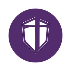
The Shield
|
For any external marketing materials, the shield by itself or reversed within a circle can only be used when accompanied by the full Trevecca logo elsewhere in the materials. For on-campus signage, the shield may be used without being accompanied by the full logo. |
 |
 |
Logo Construction, Clearspace & Computation
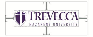
The exclusion zone is the minimum area around the logo that must remain clear of text or any other graphic elements. The measurement is calculated by using the ‘T’ of the Trevecca logomark.
Logo Size
Horizontal Logomark - 1.5” minimum width
Secondary Signatures
All departments and schools are provided with a secondary signature to use on all marketing pieces.
Official University Seal
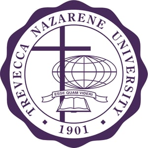 The center of the seal contains the symbols that designate the mission of Trevecca. At the bottom is an open book, a symbol for learning and truth, and also a symbol for the Bible. Above the book is a narrow banner containing the school motto in Latin (Esse Quam Videri - to be rather than to seem). The motto emphasizes Trevecca’s commitment to truth, authenticity, and integrity. The cross indicates that Trevecca is a Christian institution, one that draws its meaning from Christ’s life, death, and resurrection.
The globe signifies the University’s commitment to educating citizens of the world, people who will recognize their responsibility to the world at large and will seek to become leaders and servants in the world. The seal of the University is not to be used as a logo or campus icon. It is reserved for use primarily by Administration and is the only official seal for the University, as approved by the Board of Trustees. The seal can be used on formal documents and certificates, but it cannot be changed in any way. It may only be printed in purple, black, a screen of black, or foil stamped.
The Colors
Color plays an important role in the Trevecca corporate identity system. The colors shown are recommendations for various media.
Primary Colors System
Trevecca has three official colors: Purple, Dark Gray and White. These colors have become a recognizable identifier for the university. They are used as the dominant color palette for all internal and external visual presentations of the university.
TREVECCA PURPLECMYK: C080 M097 Y025 K013 |
WHITECMYK: C000 M000 Y000 K000 |
|||
DARK GREYCMYK: C000 M000 Y000 K090 |
||||
80% |
60% |
40% |
20% |
|
Secondary Color System
The Secondary colors are complementary to our official colors, but are not recognizable identifiers for Trevecca Nazarene University. They are used to accent and support the primary color palette.
Unacceptable Uses of Visual Identity
Typography
Typography plays an important role in communicating an overall tone and quality. We have selected the following typefaces to represent in our brand in a variety of circumstances.
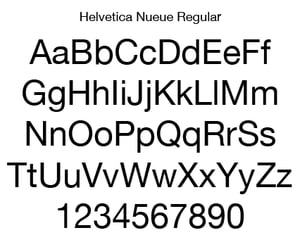 |
Helvetica NeueHelvetica has earned its popularity for good reason. A regular work-horse; this typeface gets the job done and carries the weight of legibility and style. We like to use Helvetica in headlines and body copy. We particularly love the condensed weights of this versatile family. |
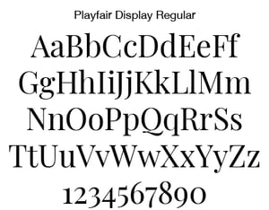 |
PlayFair DisplayYou’ll recognize this font from our beloved Treveccan masthead and the very website you are perusing. Versatile enough to be used in headlines and body copy, this typeface conveys our playful (see what we did there) nature while maintaining a clean and professional appearance. |
 |
Montserrat RegularLiving in the same family as Helvetica, Montserrat has a fresh and crisp look thanks largely in part to our use of Montserrat. The bold geometric characteristics pair well with our bolder fonts (such as PlayFair Display and Bebas Nueue) to add sophistication in small doses. Our favorite trick is to all-caps and track out headers in Montserrat Bold. This font is also versatile enough to use in body copy, though we recommend maintaining a proper point size to insure readability. |
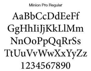 |
Minion ProMinion Pro is our choice for body copy. This typeface is balanced, conservative, and a bit of a chameleon in nature. Minion is a slightly condensed typeface and features exaggerated characteristics and sloped serifs which drive the reader forward effectively for ultimate legibility. |
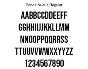 |
Bebas NeueBebas is our bold-and-in-charge typeface of choice for accents or headlines. Being a display font, we reserve this use for small amounts of copy only. We primarily use Bebas for our School of Graduate and Continuing Studies pieces and anywhere else that we could use some contrast to the body copy. |
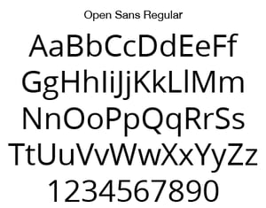 |
Open Sans ProWe use Open Sans for our web and email body copy. This sans serif font is beautifully understated, and effective enough to be used in print pieces where Helvetica or Mr Eaves just won’t do. |
